
Supplies: and many mower; scallop oval punch; scallop trim border punch; 5/8" rich razzleberry satin ribbon; cottage wall dsp; crumb cake, whisper white, rich razzleberry, chocolate chip card stock; rich razzleberry, old olive ink

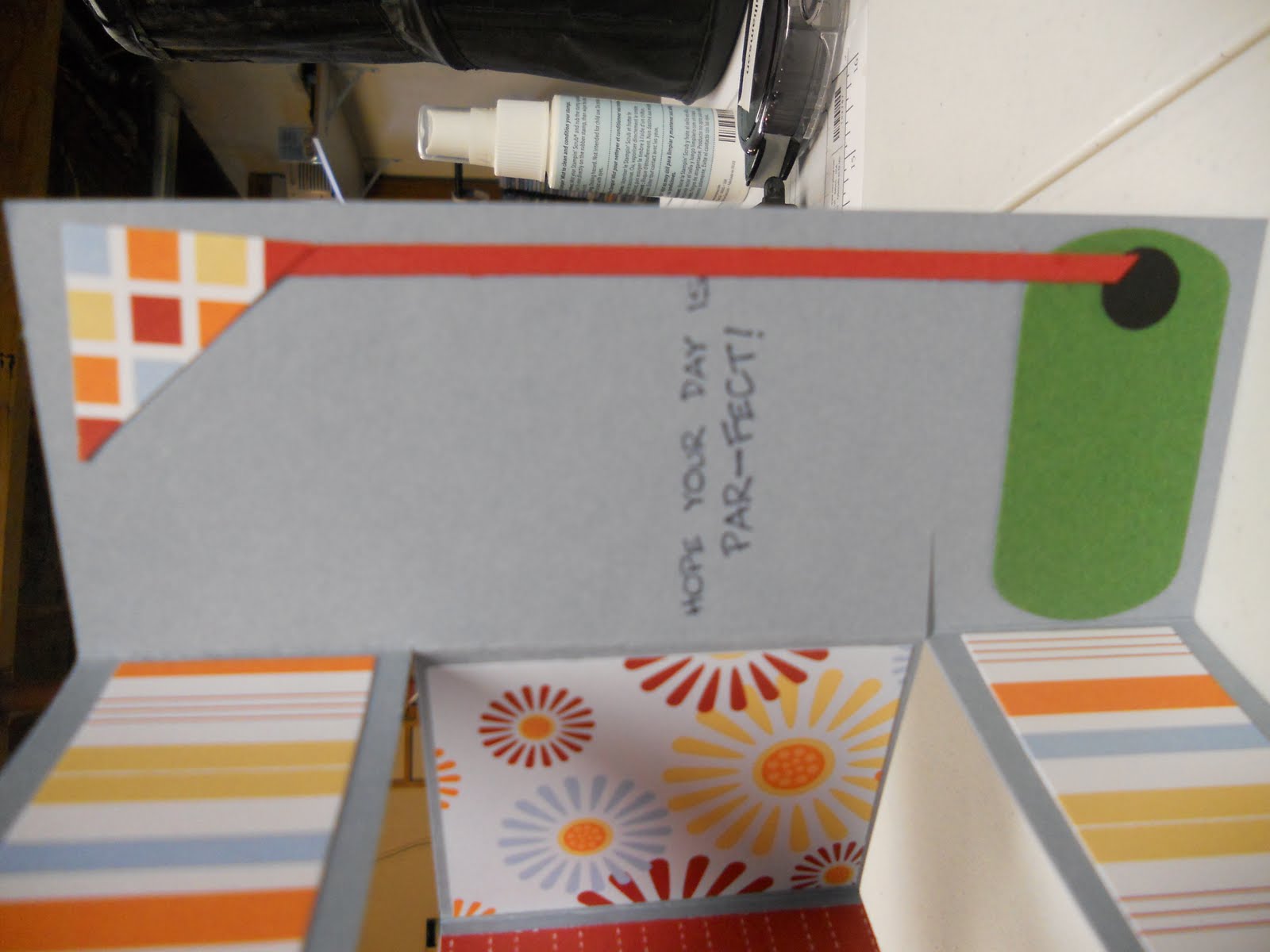
 Here is the second card that I made using and many mower. When I was making these cards this weekend, I went to splitcoast to find inspiration and the inspiration for thhttp://www.blogger.com/img/blank.gifis card came from Creations by Corie, another SU demo. I didn't CASE (copy and share everything) her card entirely, mainly because I didn't have all the supplies, so I CASED as much as I could with what I had. See Corie's original card here.


 My husband is awesome at many a thing but he sometimes has a hard time picking cards that will be good for his dad. I also have a hard time making cards that he will like so since father's day is next week I decided to get a jump start on making a variety of cards for him to choose from. I don't own many manly sets so I borrowed the retired "and many mower" set from Becky and Rae Anne to make some birthday and father's day cards.
  While I was making one scrapbook page my mom was creating this really beautiful name frame. I really like the colors that she ended up using and I wish that Williamson was not such a long name so I could make a name frame for myself.
 A few weeks ago I had some of my stamping friends over to celebrate National Scrapbooking Month. We all had projects to work on and some were more ambitious than others. Becky and Rae Anne made a spectacular July 4th card that I can't wait to get, Rachel worked on making her old swap fronts into cards, and my mom made a really spectacular name frame (stay tuned later this week to see it). I didn't really have anything planned to make but I knew that I wanted to make a scrapbook page. I chose graduation pictures that have been sitting waiting to be scrapped for four years.
  Last night I went to Rachel's monthly stamp a stack. We made three really pretty cards but I wasn't feeling up to coloring on the Rose Red card so I used the flower stem from Bold Blossom's instead. This morning I finished the card using the new Blossom Bouquet Triple Layer punch and some flowers that I had saved from a previous project. You may notice that several of my flowers didn't punch correctly but I think it turned out to be a very happy accident :)